Dashboards are powerful visual tools that help various aspects of your business identify key performance indicators (KPIs), outlying data points, uptime and downtime, and other various goals. Creating an IT dashboard can be helpful for your day-to-day business and for long-term strategy.
When creating your dashboard, there are a few things to keep in mind. Audience, actionable metrics, and readability. These 3 factors are important when creating any IT dashboard.
The Audience for Your IT Dashboard
When you’re thinking about your dashboard, make sure you consider who will view it on a consistent basis. Is it your boss? Will the CTO see it?
Ask yourself if that person cares about the metrics on your dashboard. If you can’t honestly answer that question, you should communicate with that party. Ask them what they’d like to see and what impacts their day to day. Ask them what would de-rail their day too.
The last thing you want with an IT dashboard is to force your audience’s eyes to gloss over when they read it. If that happens, they won’t ever look at it again.
Actionable Metrics
When you know your audience, that will lead you to the right category of metrics. For IT, this could be everything from:
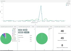
- Failed Login Attempts
- Server Up-time
- Bandwidth Usage
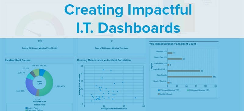
- Incident Root Causes
- Incident Categories
You need metrics that are actionable if they’re going good or bad. For instance, if you see a spike in failed logins, you can look at the I.P. address or location to see if there is someone trying to gain access that shouldn’t be.
Uptime is a good metric to see how well you’ve done over a given time period. If you see that your uptime this quarter is significantly lower than last quarter, you can dig into some problems or changes you’ve made to see if that’s affecting it.
Readability
Remember that it needs to be easy to understand your metrics too. What visuals will help you illustrate the data most efficiently? There’s tons of ways to display data visually. It could be anything like:
- Spark Lines
- Pie Charts
- 3×3 Tables
Your goal is to give someone the data they need quickly so they can dig into more data if they need to.
Colors play a large part in dashboard readability. Pick colors that compliment well. Use the highest contrast on the most important indicators so the eye goes there first. Typically your most important items will go on the upper left since that’s where the eye starts because of readability.
Also consider the manner in which the dashboard will be read. Paper can communicate a lot more details quickly if presented well, so don’t over look that as an option. While monitors and other displays are becoming more powerful, they still occasionally lack detail. However, they gain flexibility through interaction. So make it clear that data can be manipulated if possible by integrating mouse-hover effects and such.
BONUS TIP: Be careful with 3D. 3D effects should only be used when it compliments the data. Don’t do it because you think it’s visually pleasing.
Conclusion
If you keep these 3 areas in mind when you create a dashboard, you’ll definitely increase it’s usage. While some of these tips may seem obvious, I challenge you to go through your existing dashboard and ask yourself a few questions about each metric:
- Does every stakeholder for this dashboard care about this metric?
- Is this the most important metric? Is it easily spotted in this dashboard?
- Can I display this data any differently to make it easier to understand?
These 3 questions will help you ensure that your dashboards are the most effective.