Have you heard the latest Apple gossip? We hear the new iPhone drops in September for a slick 50 (ouch!). We also heard that it will be available in gold. What have you heard?
What you may have missed, though, is the announcement of iOS7. That’s right folks, an update to the iPhone’s mobile operating system is expected in the fall. The new iOS will be the first major design and interface change since the iPhone’s release in 2007. No major change in six years? That’s decades in the tech industry! As the juicy tidbits about of new features and system requirements continue to leak, many app developers are asking, “What does this mean for our app?”
Before we get to the “what’s it all mean?” stuff, let’s discuss what’s we can expect with iOS7.
Design Changes
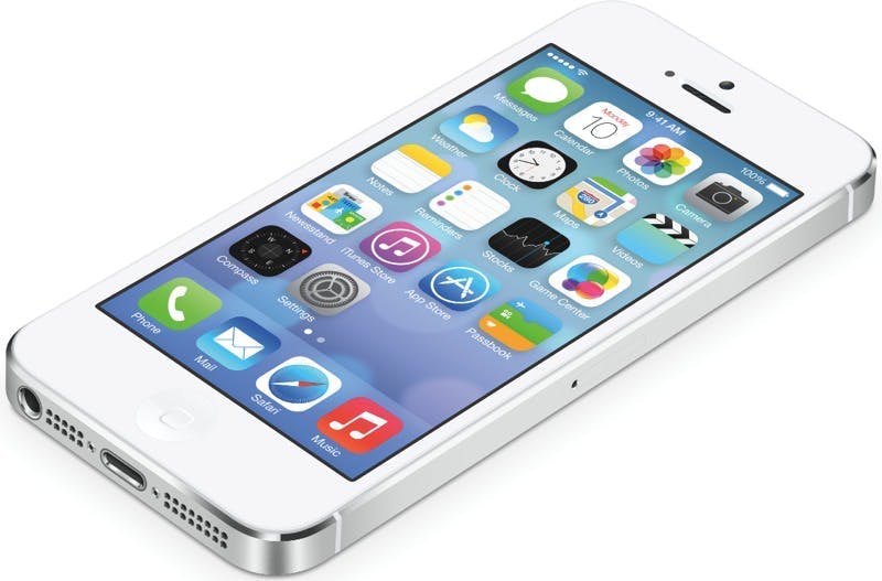
The new operating system’s design has moved away from their traditional skeuomorphism and is now completely flat. This means they’ve gotten rid of the shadows and soft edges and replaced them with plain colors and hard line.
- Icons will now be border-less and appear to “float” on top of the background.
- Folders are translucent.
- Apple’s primary font will be Helvetica Neue UltraLight; the font size is customizable.
- Blue, red, white, black, and pastel is the new color scheme for the operating system.
This is a major shift from how things used to look in previous versions of iOS and the change is still a hot topic among designers.

Interface Changes
Users can now multitask and quickly switch from app to app. The new layers function allows rapid flip back and forth between screens. Notifications are now more organized, with different tabs for the alerts, messages, and missed calls. This means more control over alerts, too.
What’s Next for Developers?
Wow! Those are some big changes! The question on everyone’s mind: how is this going to affect my apps functionality?
If developers want their app to seamlessly graduate to iOS7, the changes will need to to be taken into consideration (and the app will need to be updated). A little overwhelmed? Seem difficult? That’s okay! Apple listed these three guidelines in their UI transition Guide.
- Deference– The UI helps users understand and interact with the content, but never competes with it.
- Clarity– Text is legible at every size, icons are precise and lucid, adornments are subtle and appropriate, and a sharpened focus on functionality motivates the design.
- Depth– visual layers and realistic motion heighten user’s delight and understanding.
If you’re unsure of where to begin, ReadWrite wrote this helpful guide to get you started.
There is a lot to consider before the iOS7’s release in the fall; starting thinking and executing now so your new-and-improved app will be ready when the update hits. This could be a great opportunity to revamp your app with new features before everyone else! You can also design an app that showcases the new bells and whistles.
What are your thoughts on the iOS7 redesign? Let us know in the comments below!
Image Credit: ReadWrite.com